Implementing Color Psychology in Interior Design
Share this article:
Written by: Evolution Furniture
Colors affect the way we feel. Colors can express, inform, and even facilitate emotional responses. When different colors are used in interior design, those colors impact our emotions when we enter a space. In this article, we'll explore the influence of color psychology in interior design, and discuss the role that color plays in creating harmonious indoor spaces.
Role of Color Psychology in Creating Harmonious Spaces
The colors we use to decorate our homes are all associated with specific emotions. While every person has their associations and feelings about each color on the spectrum, color psychology has specifically linked each color of the rainbow with different emotions.
Some colors are energizing, while others evoke feelings of peace and calm. Some colors are associated with passion and movement, while others are associated with thoughtful, quiet moments.
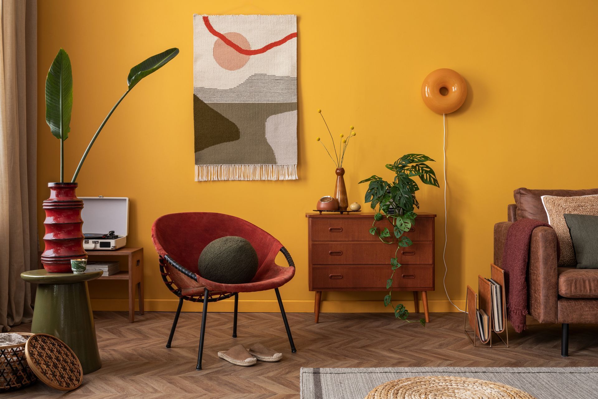
Warm Colors
The warm colors include red, yellow, and orange. These colors advance from the wall, paper, or screen where they're located. They "pop". These colors are associated with aroused emotions, passions, movement, and excitement. Warm colors can create a feeling of coziness and warmth.
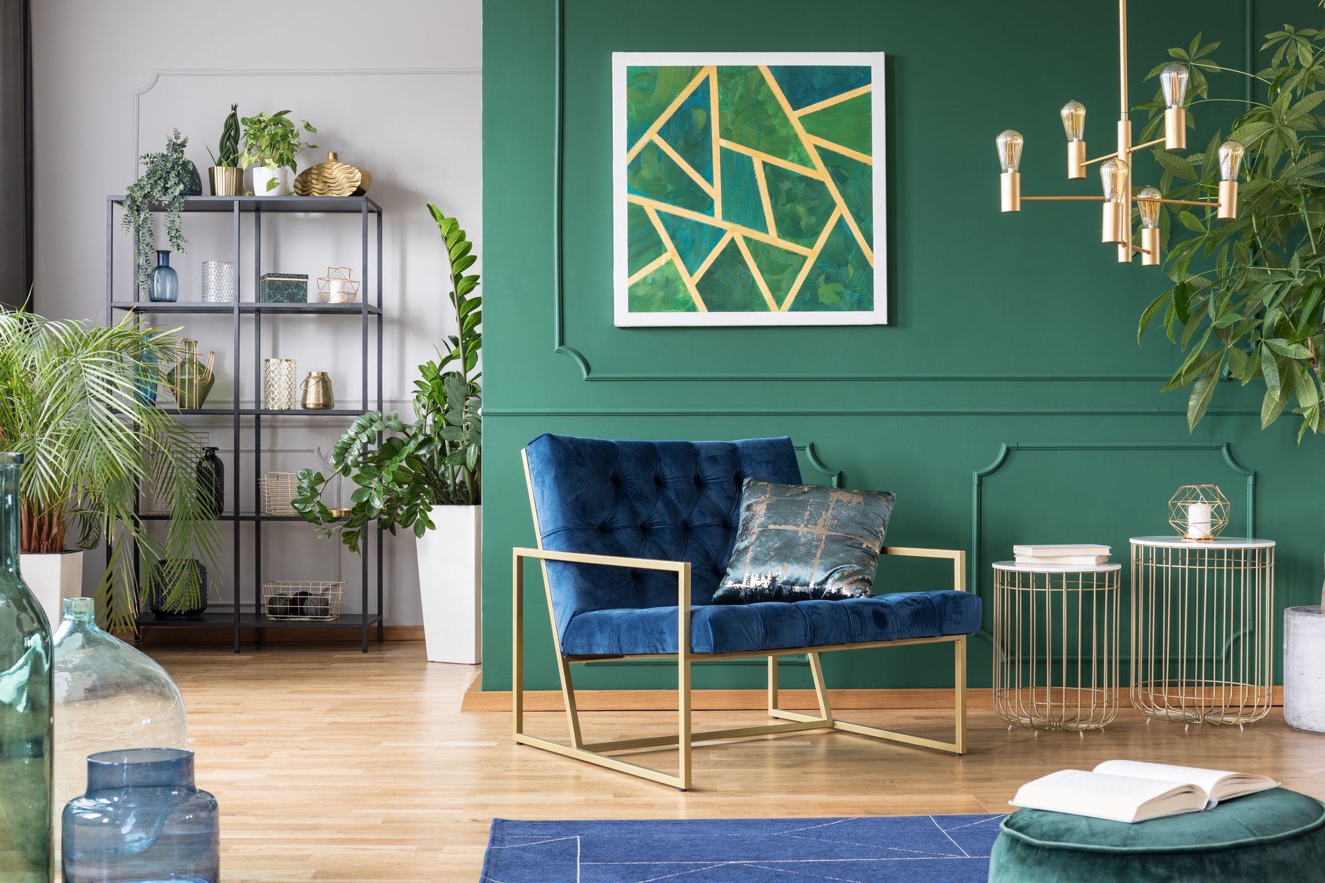
Cool Colors
Cool colors include green, blue, and purple. These colors recede and are associated with thoughtful, introverted, and peacefulness. Cool colors create a sense of calm.
Emotional Effects of Different Colors
Each color is different, so when you're choosing a color for your room or furniture, it's important to understand how each color can affect you and the people in your home.
Red
Red is associated with passion, romantic love, action, and warmth. It's no coincidence that red is associated with both devils and cupids. Red is also a very flexible color that can be darkened to a more earthy, subtly relaxing shade.
Yellow
Yellow is the most cheerful of all the warm colors, and when mixed with white, can be more thoughtful and calm. Yellow in its purest form can be very bold and exciting.
Orange
Orange is a color that can be vibrant and action-focused, or it can be darkened for an earthier, nostalgic hue. Orange is less commanding than red but still representative of movement and change.
Blue
Blue is a color that is associated with the sky and water, coolness, and relief. It can be representative of childish playfulness, or a deeper, more thoughtful calm.
Green
Green is a color that is associated with renewal, abundance, prosperity, and growth. Green is the color of spring returning and the development of seeds. Green can be mixed with gray and white to create various forms of earthy, sage colors.
Purple
Purple is associated with creativity, wealth, and prosperity. Purple in its lighter forms can be lighthearted and sweet, while in its darker forms can be associated with royalty.
Pink
Pink is associated with love, tenderness, and sweetness. Pink is a mixture of white and red, so it has some of the same associations with red.
Black
Black is a color that's often associated with strength, deep thought, and depression. In interior decor, black is often used as an accent color: a little goes a long way.
White
White is one of the most commonly used neutral colors because it goes with so many other colors. White is the perfect complement to most all non-neutrals. It's associated with purity, innocence, and honest intentions.
Brown
Brown can be comforting, brooding, natural, and earthy. This color is also one of the most commonly used neutrals, often found in common areas of the house that are frequently seen by visitors.
Grey
Gray is a very popular neutral that brings cool, calm, and peace to a room. Gray is easily paired with almost all non-neutral colors.
Choosing Colors for Specific Room Purposes
Often, people choose colors for each room of the house based on who will be using those rooms. Take this into consideration as you choose a palette for your home.
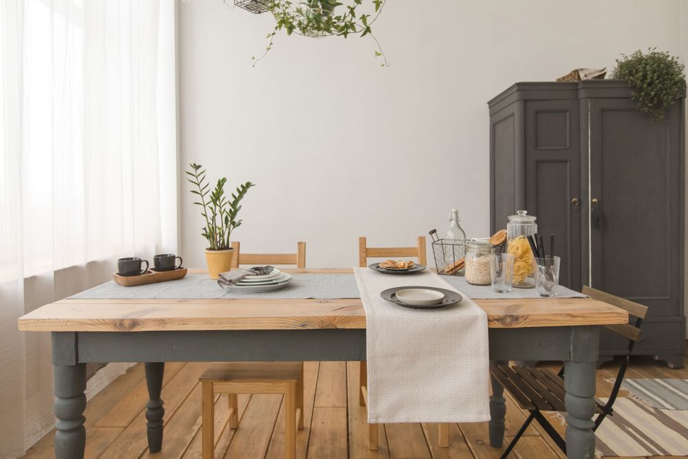
Living Room
The living room is a common space, where people gather for family events and where guests are received. Often, homeowners choose understated colors for their living rooms because this puts people at ease and makes for a comfortable environment. Here, you'll find colors like white, gray, cream, and brown.
Bedroom
The bedroom is a part of the house where people often decorate with soothing colors that are conducive to relaxation and sleep. Greens and blues are popular bedroom colors.
Kitchen
The kitchen is a place of warmth and togetherness. Warm neutrals like browns and creams as well as bright shades of blue and green are popular in these spaces.
Bathroom
The bathroom is an area of the house where people commonly pick a theme, and that theme may inform the color. As a result, bathrooms can be any color from yellow to gray to pink.
Office Space
Office spaces are often painted in colors that support thoughtful work. Gray, blue, brown, and accents of white and black are common in office spaces.
Nursery
Nurseries tend to be cheerful spaces, so homeowners often turn to colors like yellow, pink, blue, and green for these rooms. Keep in mind that the baby's gender may inform the color, or it may remain gender-neutral.
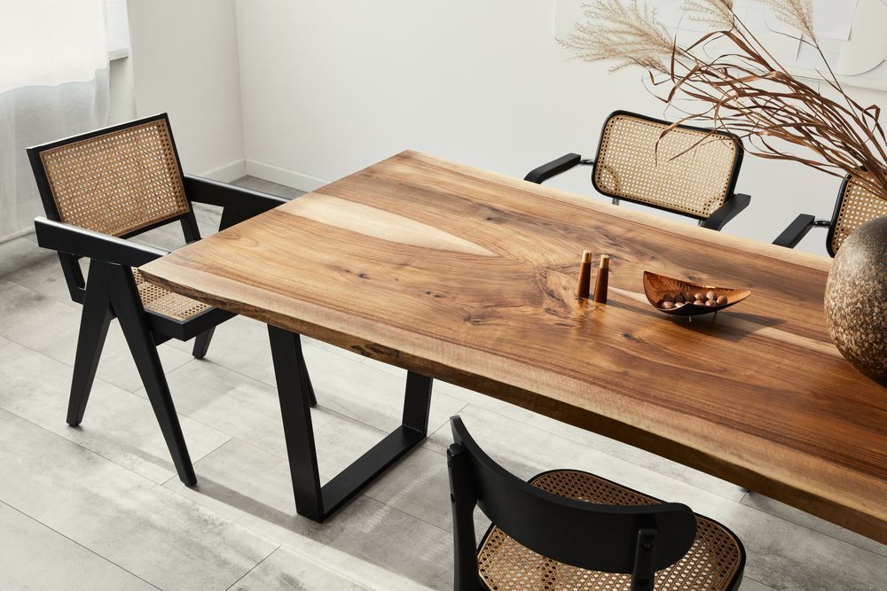
Integrating Color Psychology Interior Design in Custom Furniture Pieces
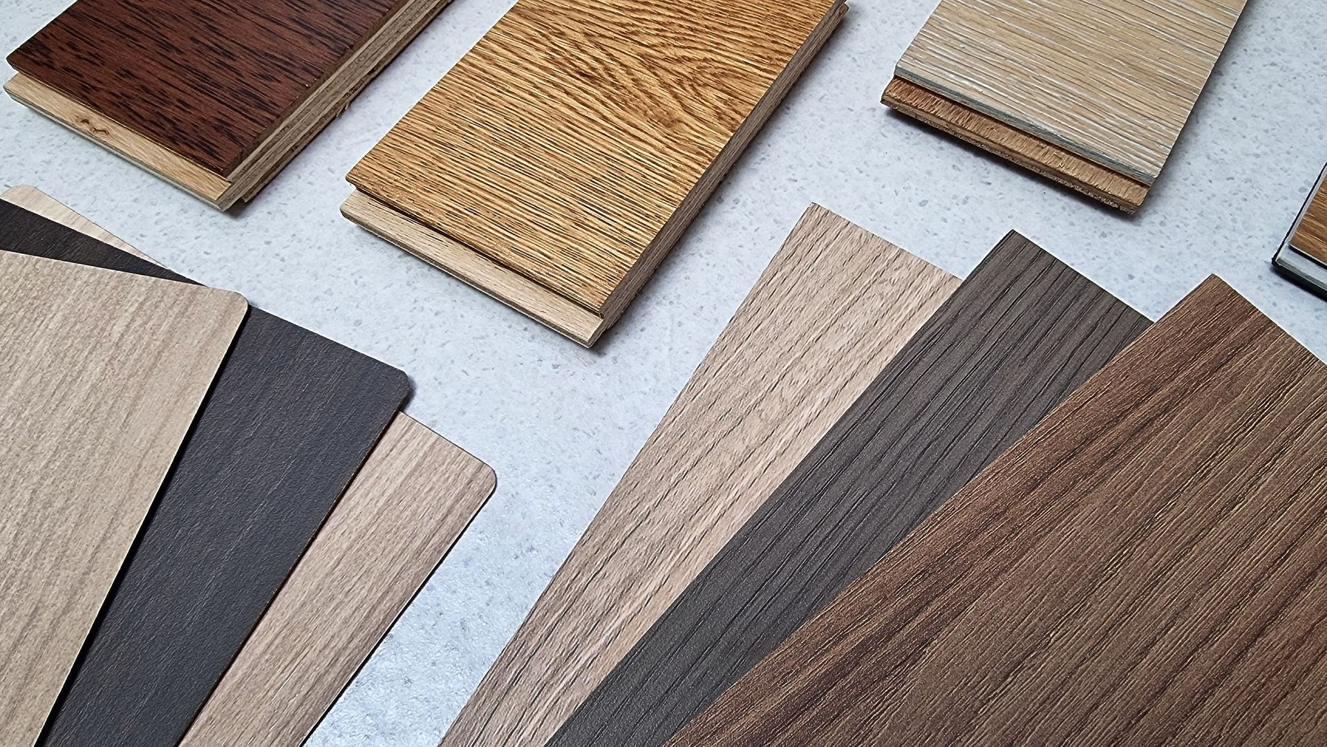
When you're integrating color psychology into your custom-made furniture, it's important to choose a color that coordinates with the rest of the room. If you enjoy changing room colors frequently, or if you plan to move this piece of furniture to other rooms of the house over time, maintaining an earthy neutral color like the natural color of the wood will give you ultimate flexibility. Some tips:
- Paint a sample of the color on a piece of scrap wood to get a sense of what it truly looks like.
- View samples of the wood stains you're considering if you're planning to leave the wood unpainted.
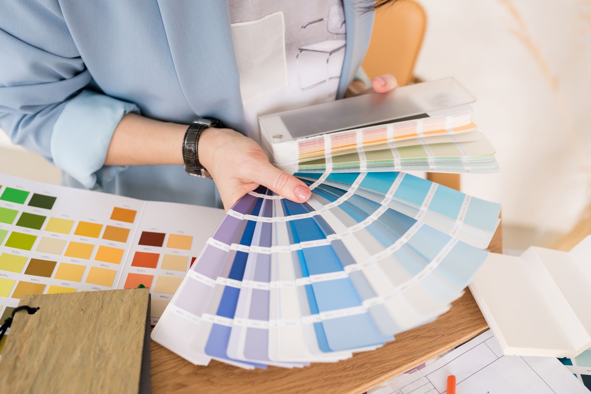
- View your paint samples in the room where your custom piece will 'live,' check on the sample multiple times a day in different lights as sunlight moves around the room or as artificial light from lamps and other electronics turn on. The way light reflects off of a paint color can dramatically change its appearance.
- If choosing a bold color, consider how different styles will look with it over time. As your design style changes, it's wise to think about potential future color combinations that can complement the bold choice and keep your space feeling cohesive.
Evolution Furniture: Crafting Custom-Made Furniture in Your Vision
Custom furniture is an investment that lasts for generations. At Evolution Furniture, we design custom furniture for consumers and furniture for interior designers. Our customers work with us because we produce elegant furniture made to last a lifetime. See our design portfolio where we offer different types of furniture styles. Want to know more? Get started with your furniture design today - contact us.